Visualizing Strategic Positioning

Gulger Mallik
Software Engineer & AI Researcher
Discover how a custom React and ApexCharts app visualizes strategic differentiation using Blue Ocean Strategy principles, identifying market gaps.
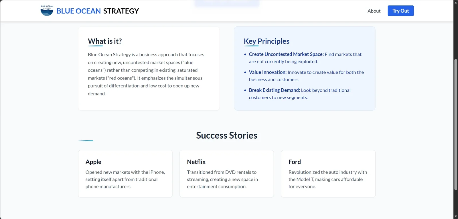
In today's hyper-competitive landscape, simply being better than the competition is often not enough. True market leadership stems from creating uncontested market space—the core tenet of Blue Ocean Strategy (BOS). To help businesses move beyond head-to-head competition, we co-created a specialized Competitive Analysis Application designed to translate abstract strategic concepts into actionable, visual insights.
The Challenge: Visualizing Strategic Positioning
Traditional competitive analysis often results in static spreadsheets or lengthy reports that fail to clearly illustrate a company's relative position against key industry factors. The goal of our application was to bridge this gap by allowing users to dynamically map their offerings against established competitors using the powerful framework of the Strategy Canvas.
Application Architecture and Key Features
Built using modern web technologies, the application prioritizes user experience and data integrity. The stack leverages React for a responsive frontend interface and ApexCharts for robust, interactive data visualization.
User Input and Competitor Definition
The process begins with defining the competitive set and identifying the critical 'Factors of Competition' relevant to the industry. Users can input multiple competitors, including their own company, and assign numerical scores (e.g., 1 to 10) across these defined factors.
- Dynamic Feature Scoring: Allowing stakeholders to quickly adjust feature emphasis and competitive parity scores.
- Multi-Dimensional Input: Supporting variables that cover price, service level, features, and perceived value.
Interactive Strategy Canvases with ApexCharts
The core output is the Strategy Canvas, rendered using ApexCharts. This visualization plots competitor scores along the X-axis (the Factors of Competition) and the level of offering along the Y-axis. Unlike static diagrams, this canvas is interactive:
The power of the tool lies in seeing immediate visual shifts when input scores are changed, transforming strategic brainstorming into rapid prototyping.
- Hover States: Displaying precise scoring data for each competitor on every factor.
- Line Comparison: Overlays allow users to compare their current profile against a desired future profile instantly.
Identifying Blue Oceans and Market Gaps
The application directly supports the Blue Ocean framework by highlighting areas where a company can 'Eliminate' or 'Reduce' factors that the industry currently competes on, while simultaneously 'Raising' or 'Creating' new value factors. A successful Blue Ocean move results in a value curve that diverges significantly from the industry average.
Data-Driven Decision Making
By forcing stakeholders to quantify subjective elements of competition, the tool embeds data-driven discipline into strategic planning. Teams move away from gut feelings about market positioning toward empirically supported strategic narratives. This clarity is crucial for securing internal buy-in for innovative, high-risk projects aimed at creating new demand.
In summary, this co-created application transforms the complex, often qualitative process of strategic differentiation into a clear, visual, and iterative exercise, empowering businesses to chart a course toward uncontested market space.
Related Articles

Reverse Engineering the AI Recruiter
Learn how to optimize your resume and application process by understanding the logic behind AI...
The End of Passive AI: Inside Perplexity Computer
Discover how Perplexity's new 'Computer' interface is redefining AI interaction by shifting from...

AI Implementation Strategy
Learn how to build a scalable AI implementation strategy that delivers measurable business value...

Claude Code’s Source Leak: What Happened, Why It Matters, and What It Reveals About AI Engineering
Anthropic accidentally exposed the full source code of its Claude Code CLI, revealing internal...
Full-Stack Efficiency
Discover how to streamline your development workflow and maximize productivity by mastering the art...
Ready to Build Something Amazing?
Let's collaborate on your next project and create solutions that make a difference.
Get In Touch